155: Ways to Update Your Kitchen (On a Budget).
When I went to view my flat a couple of years ago, it was the first property I looked at and instantly fell in love. So much so, that I didn’t even make it out of the car park before I emailed the estate agent with an offer.
I truly believe that I was meant to live in this home and when I thought about myself living here, more often than not, I pictured myself standing in the kitchen preparing a meal.
The kitchen is an important part of my home and I spend a lot of time there - and this flat had an almost brand new, top-of-the-range kitchen ready and waiting. It was a massive selling factor that I knew would save me time and money down the line because I didn’t need to replace it.
That being said, although the kitchen was pretty much perfect, it was still missing something for me and I knew I wanted to put my own stamp on it.
When I had visitors, I rarely dared to mention that I wanted to change any part of the kitchen, because I was always met with the same responses:
"There’s nothing wrong with it, I’d just leave it”
" You’re so lucky, I wish I had a kitchen like this”
And then I’d feel bad about it. I knew I was lucky, I knew it was a great kitchen.
I also knew that it wasn’t what I would have picked for myself, and although I was grateful for it - I needed to make it feel more like me.
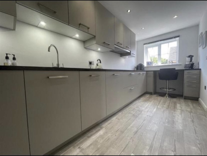
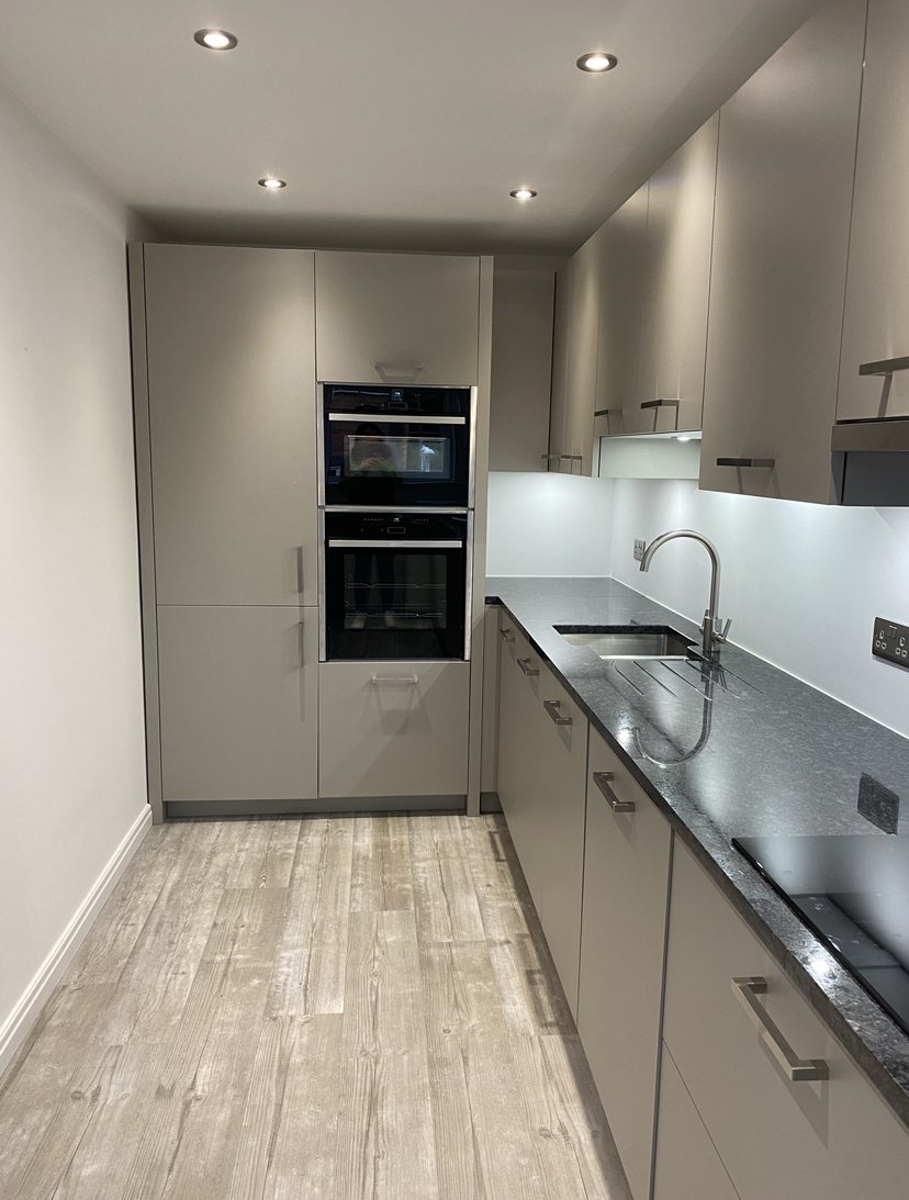
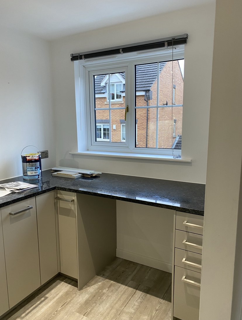
The kitchen as I bought it…
Banish the grey
I’m the first to admit that I don’t like grey in my own house. I find it too cold a neutral for me to relax in. But I wasn’t about to change my grey cabinets and I didn’t want to paint them at risk of ruining them. I noticed they had a slightly taupe undertone so I decided to lean into this.
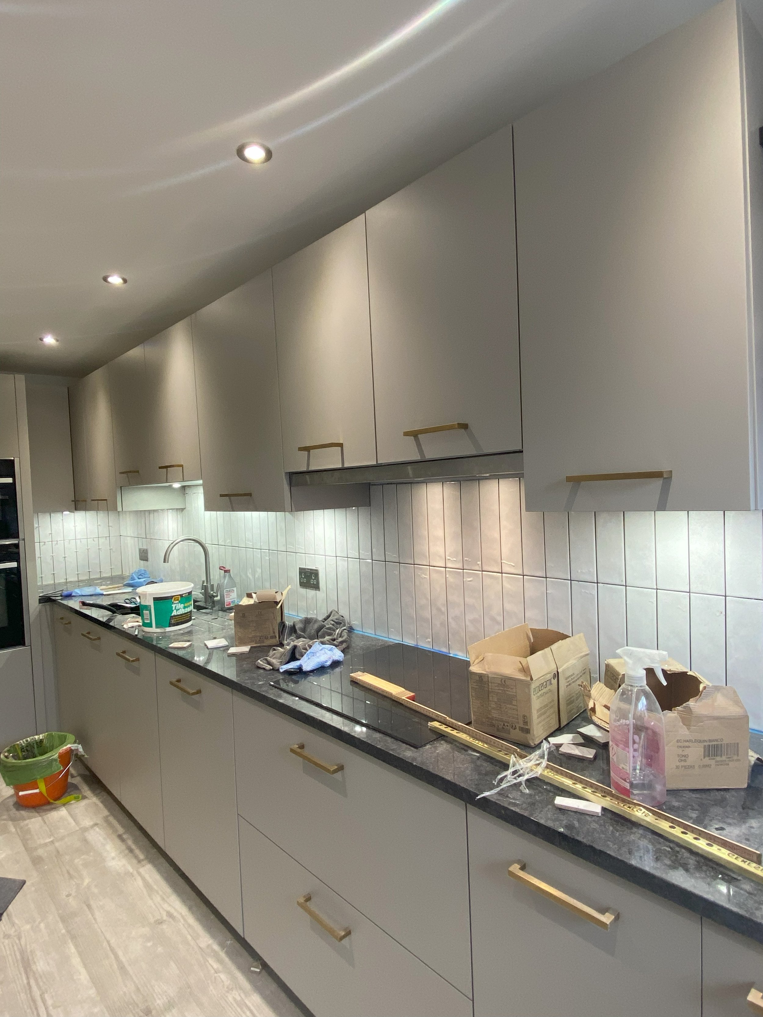
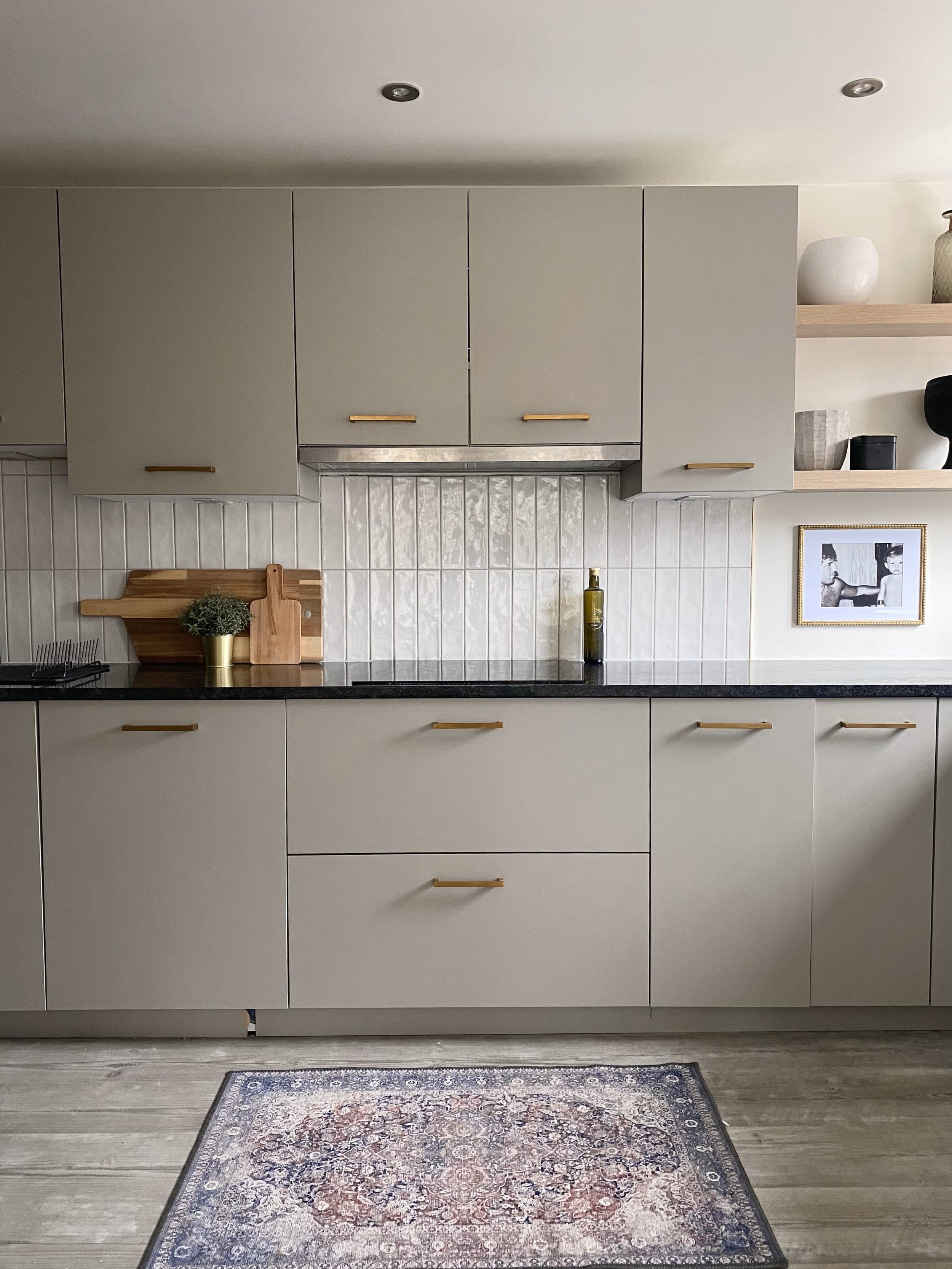
The very first thing I did was to swap out the silver handles for brass ones and already the kitchen felt warmer. I still had silver sockets and taps but I like the interest that mixing metals brings.
I also repainted the walls from “Brilliant White” to “Timeless” by Dulux. I’ve used this warm white all over the house and it just brings a much-needed softness to the room, whilst still feeling fresh. Luckily, I didn’t need to buy more paint as I had enough left over from earlier projects.
I also spent a long time considering installing a tiled splashback. Initially, I wanted to use a large format Carrara marble tile, with deep brown veining, which I still think would have been beautiful.
In the end, it came down to budget and I needed a cheaper alternative - plus I was a little worried that the brown veins would clash with my black worktops.
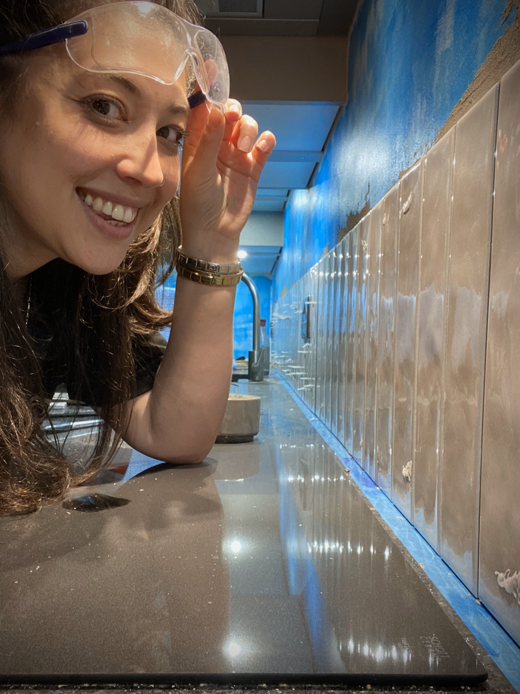
I instead used a textured cream tile, laid vertically and finished with a soft taupe grout. If you’ve been following me on Instagram, you’ll know how long it took me to tile that backsplash. Spoiler: it was a really long time, but I think it was absolutely worth it in the end. I’m so pleased with how it turned out.
Choosing the grout was interesting - I had a few opinions sent my way around using a “normal” or colour-matched grout, but I had a vision to create a bit of warmth with a darker grout and it turned out exactly how I imagined (If you’re interested, I used Fugabella grout colour 44).
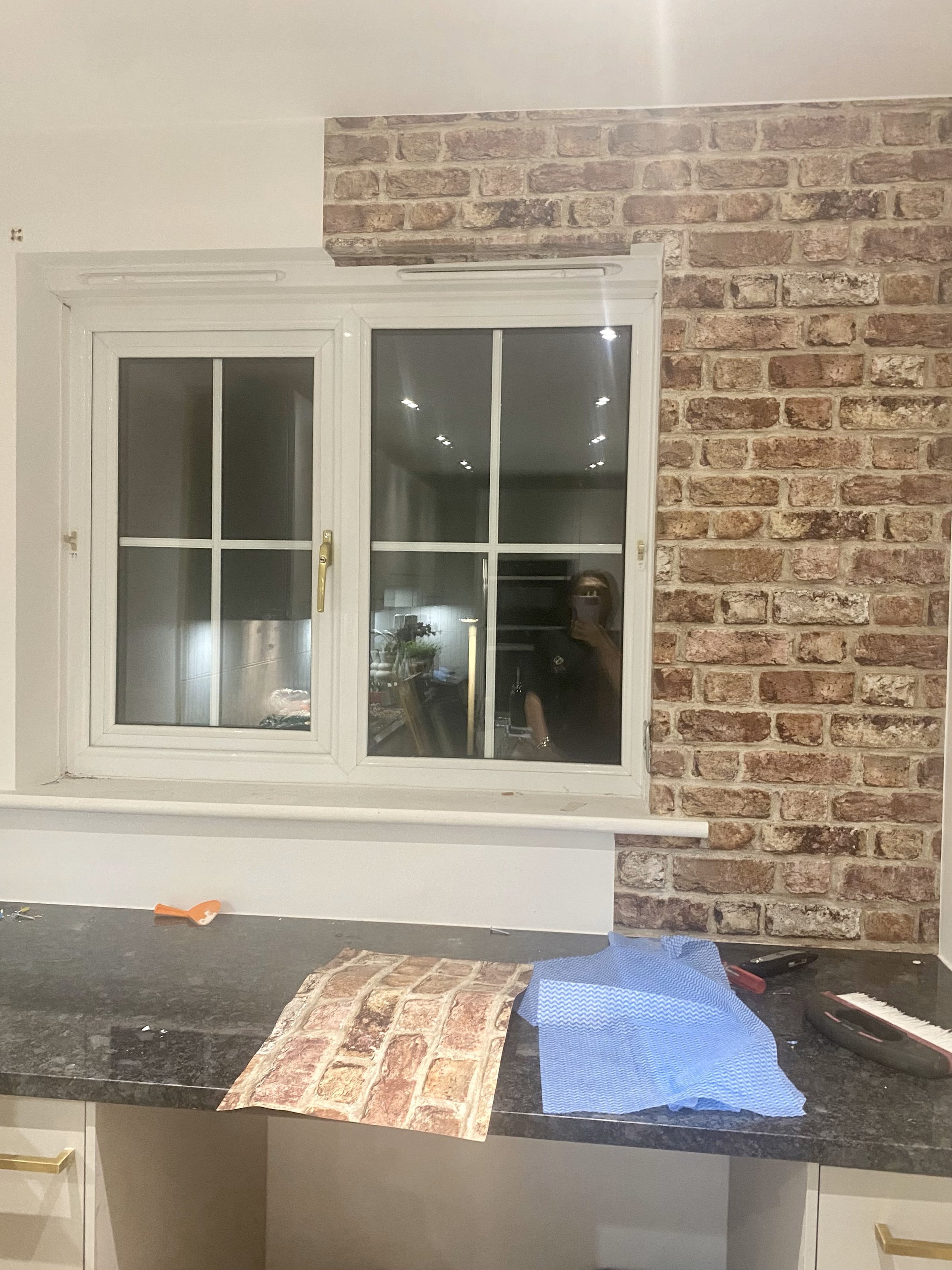
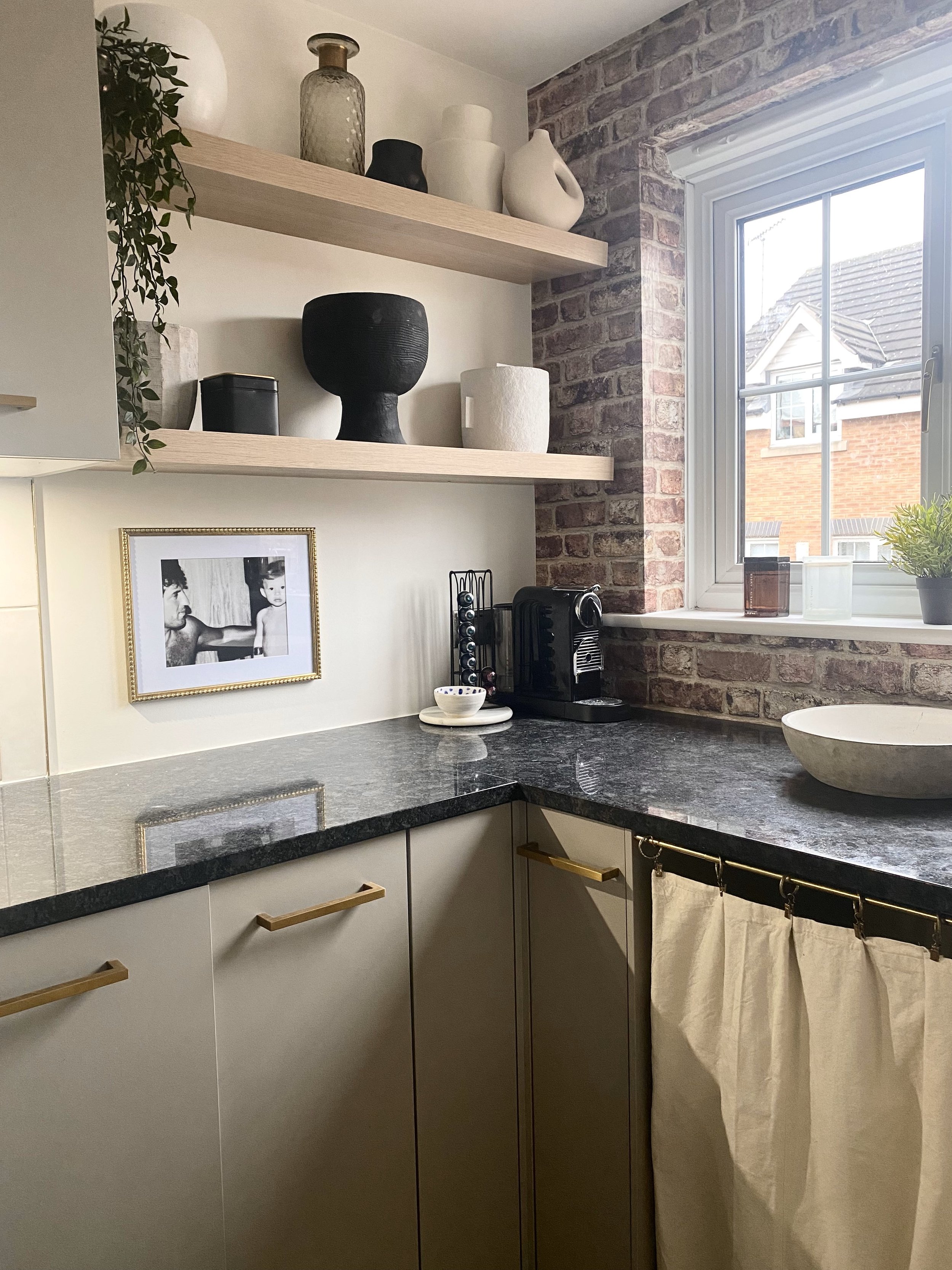
To inject just a little more warmth into the place, I got a bit adventurous and decided to wallpaper around the window with a brick effect wallpaper. I had never wallpapered before and I wasn’t sure if I was going to even like it when it was up.
Luckily, my gamble paid off and I’m glad I didn’t play it safe for once.
It works don’t you think?!
Accessorise
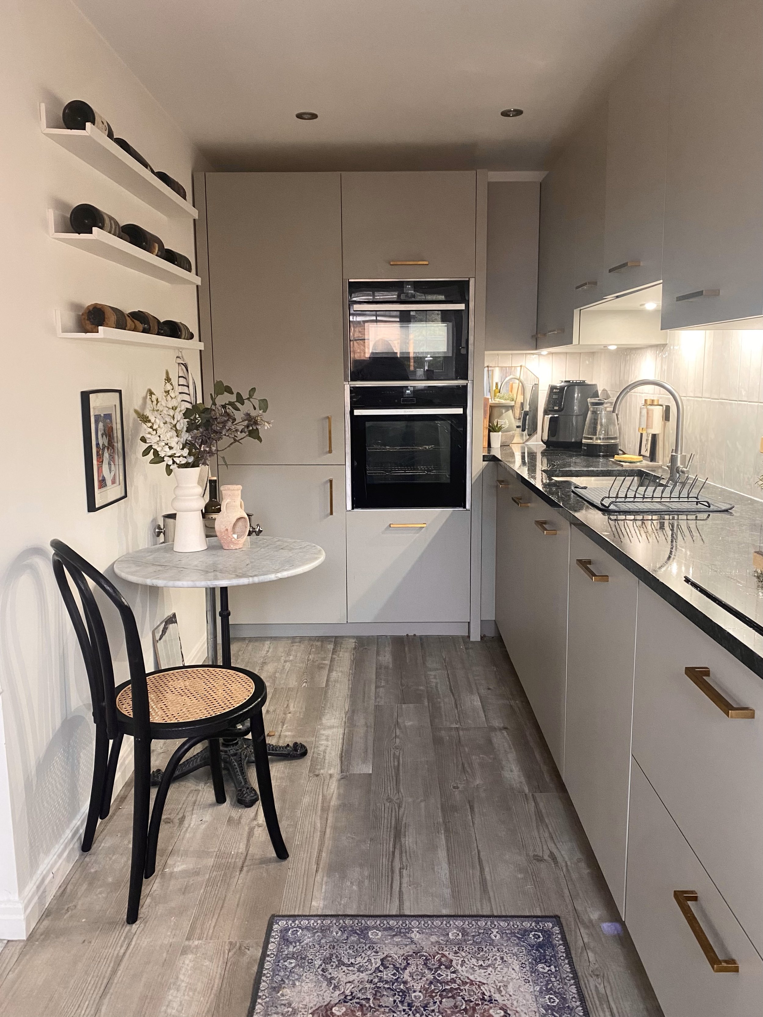
Lastly, it was time to dress the kitchen up. I’d already installed some picture shelves that I used to display a wine collection and styled it with a marble-top bistro table and cafe-style chair. I’d bought these when I first moved in so there was no additional expense for the kitchen. I like to always choose furniture that I can use all over the house. Then when I’m due a refresh, I can just move it about!
For softness, I added a patterned rug by the cooker and installed an under-cabinet curtain in what was a previously empty space. The former owner had a bar stool there and used it to work from, I was going to use it to hide my washing basket but shh! Don’t tell anyone!
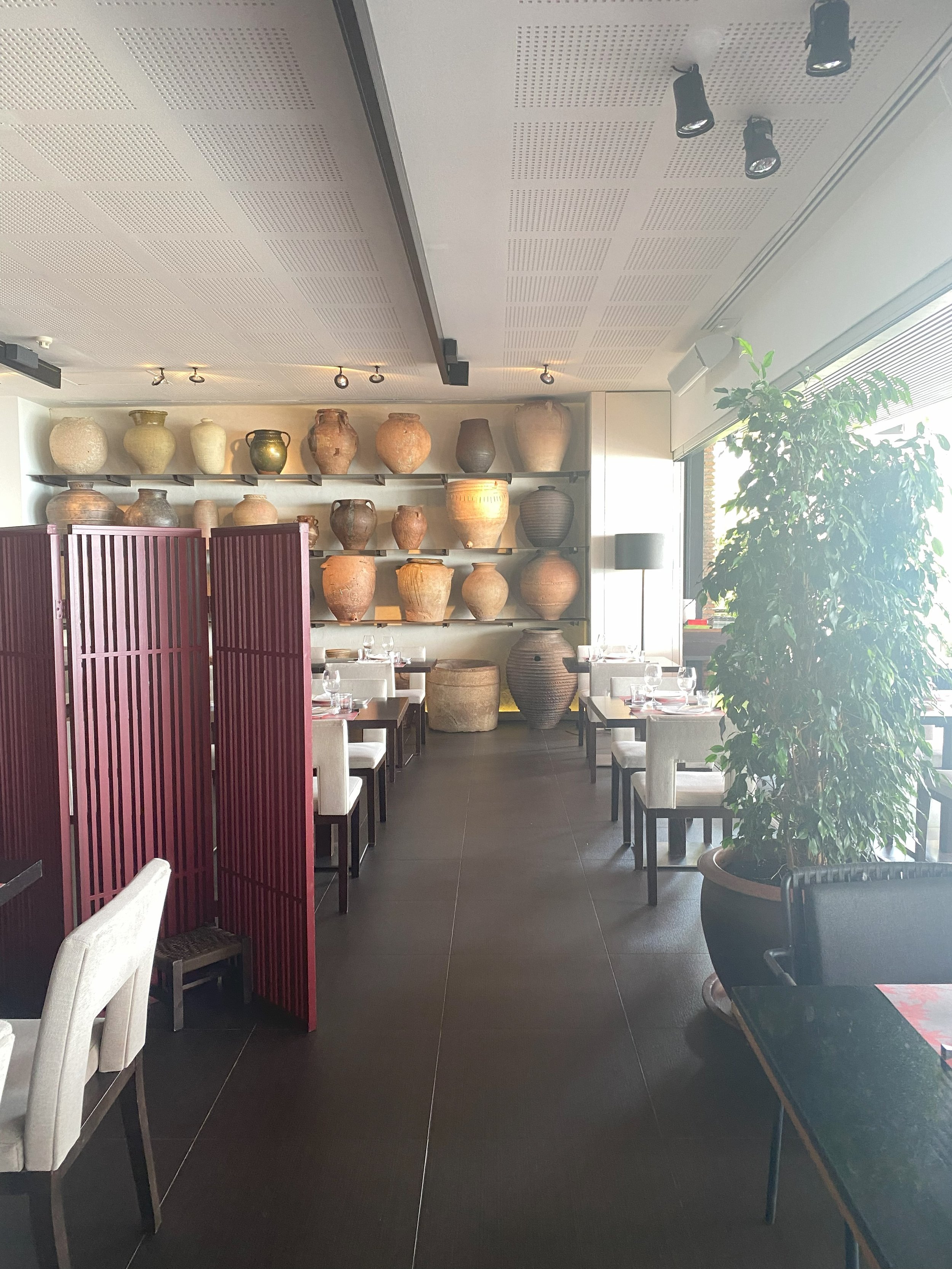
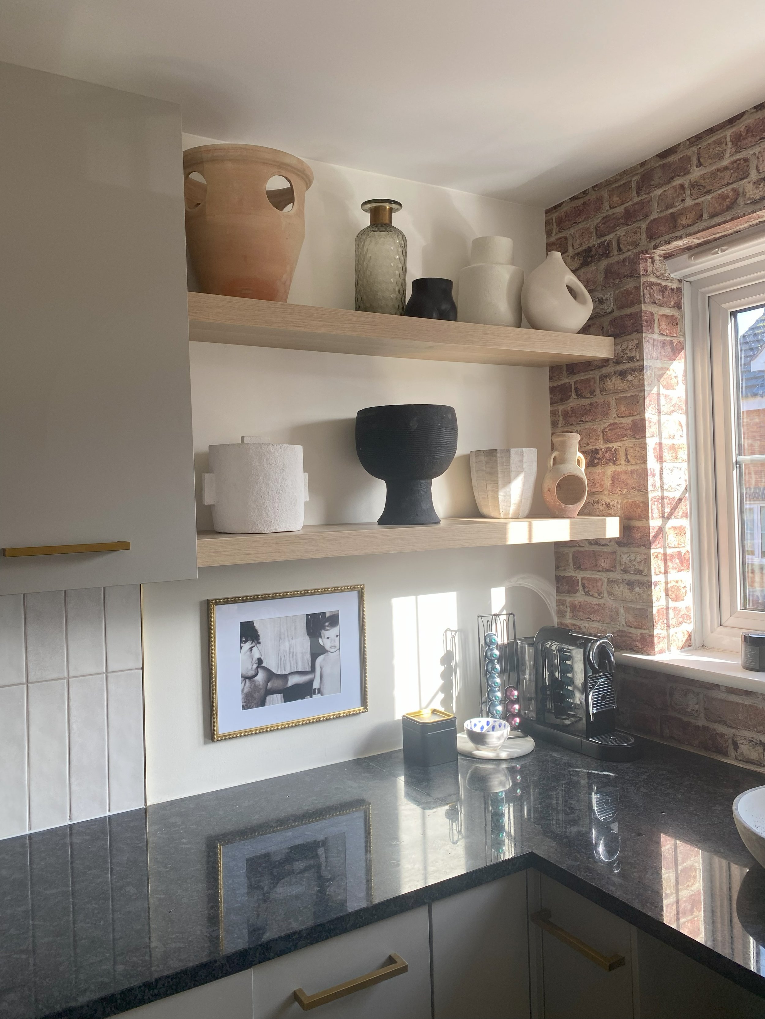
I put up some floating shelves, styling them with textured pots - inspiration that I took from a Spanish restaurant that I once visited. I added plants and chopping boards around the kitchen to pull it all together and fitted some soap dispensers with command hooks - just to be fancy.
It certainly felt warmer now, but it was also missing something that I couldn’t quite put my finger on.
The pot shelves were making me feel unsettled and I couldn’t figure out why. So I took a picture and showed it to my mum.
Of course.
Spanish inspiration and the offending terracotta pot…
We talked about it for a while before realising that there was one terracotta pot that was throwing the colour balance off and that’s what I didn’t like. So I got rid of it and instantly felt happier - sometimes all you need is a fresh pair of eyes. I’d resolved the pot situation but I was still missing something.
I often imagine design to be like cooking. When you taste your food and it’s got something missing - it needs more of a bottom. Usually, this is salt, so I needed to figure out how to season my kitchen because it wasn’t feeling grounded enough.
I looked at the textures and realised that I had too many warm natural textures together; the brick, the oak, the stone pots. I needed some coolness to add depth.
My interior design alternative to salt it seems, is black accents and mirrors. So I added a black framed mirror and voila! Chef’s kiss. Job done.
Cost
I kept my budget low because I managed to use lots of items that I already had, particularly when it came to styling. The only new things I bought to style with, were the mirror and the oak shelves. Everything else I had.
I also took a long time to bring it together - the cabinet handles I bought nearly 2 years ago when I left a previous job and was gifted an Amazon voucher. The wine display I did last year and it still works in the space so there was no need to change it.
A kitchen refresh doesn't have to cost the earth and you don’t have to get everything all at once. All in all, I spent under £600 with everything included. The only thing left to change is the floor now…because there is always something else to be done in a house!

